Time: 12:50:00
Subject: Gallery Woes
Feeling: Artsy
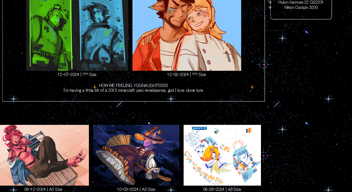
It may not be very noticeable but there is an IFrame in this page, the backgrounds parallax slightly, THIS…. ISN’T REALLY WHAT I WANTED TO DO LMAO
While the featured section is wonderfully laid out with the aforementioned Pomelo method, the way I have these pages set up means that anything using that method will stay in place if you scroll and will just overlap with the rest of the content on the page. I don’t really know how to fix this in my current setup and is smth that I will have to figure out how to fix or keep it in mind with future pages.
Hopefully this isn’t a common issue, since this is a VERY image heavy page, Shrines shouldn’t have much trouble with it since they’re going to be mostly inline.
Time: ???
Subject: Houston we've made landing
Feeling: Grounded
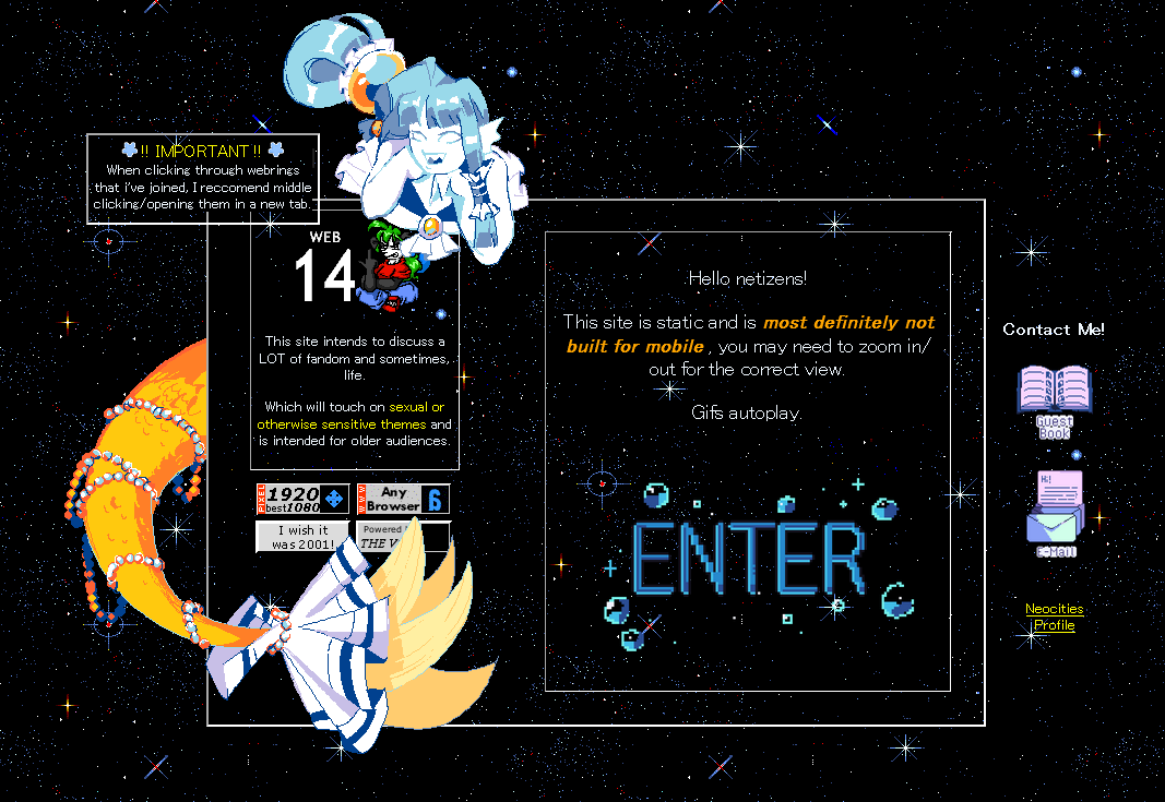
The implementation of the landing page!!
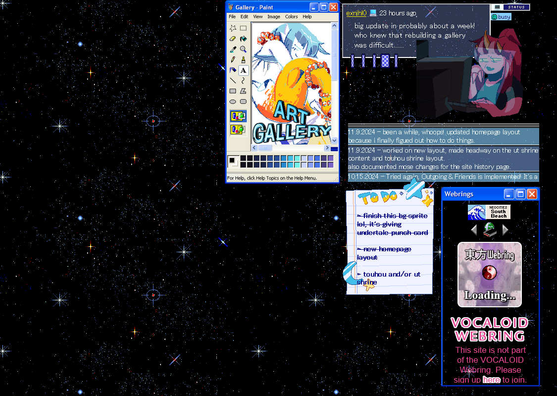
This is one of the easier pages I’ve had to make tbh, I realized that I should have one when, looking at my site on my significantly larger monitor, the background of my site tiles and since everything is static it can look TINY, so this is just a little warning (plus site rating).
Very impressed with how I did the Kore graphic! First time doing something like that :D
Time: ???
Subject: RE: layout revamp
Feeling: Thinking
Time: ???
Subject: Layout revamp start
Feeling: Progressive
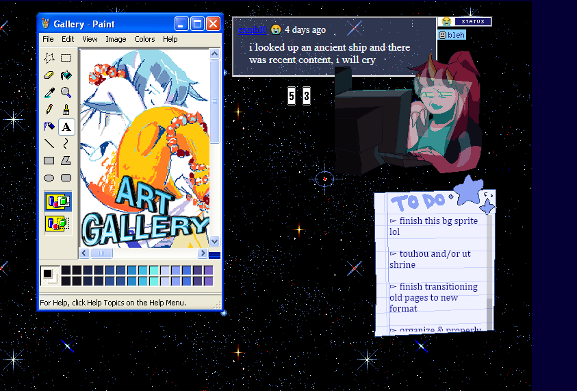
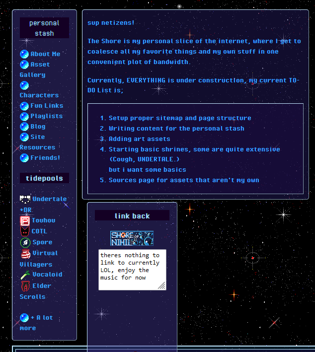
Revamped the home page!
I actually got some advice from
 on how to make a more compact and all around more
customizable layout, which is honestly what I was trying to do from
the beginning, I feel kind of silly for not figuring it out sooner LOL
I’m very happy with where its’ headed, I’m definitely someone who likes to layer everything and make it all overlap and connect with each other so this is a very good start, just a few months after the actual start but w/e.
Time: ???
Subject: CSS central
Feeling: Efficent
Made some adjustments to the CSS/Styling of the site, while not a total revamp the styling is now on a centralized CSS document where I won't
have to stress about it anymore. It initially gave me a lot of problems but whatever I did today seems to have worked out just fine.
coding is weird.
Time: ???
Subject: Page get!
Feeling: Additional
Added Friends page.
Time: latererer
Subject: mistakes
Feeling: Mistaken
Time: laterer
Subject: interactive site elements
Feeling: Intuitive
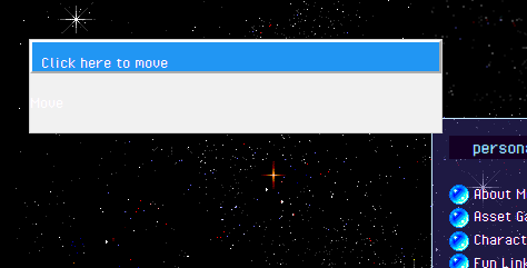
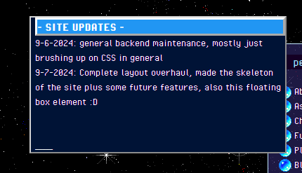
Again not much to say here, I found a snippet that made a draggable box, which im currently trying to figure out how to do myself for ease of maintenance, this was initially going to be a site update text window, but this page has kind of replaced it entirely SO, it's just the box that holds my Guestbook, which you should sign ;D
Time: laterer
Subject: early layout finish
Feeling: Proud!
Time: later
Subject: UT font discovery
Feeling:
Time: ???
Subject: Site builders!!
Feeling: Enlightened
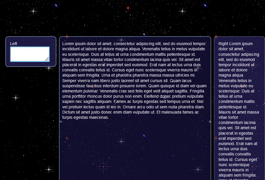
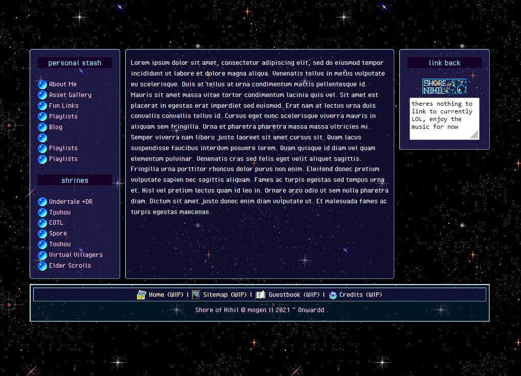
Okay, at this point I discovered SadGrl/Goblin-Heart's (old) Layout builder and my life was saved from my own stupid, EXTREMELY helpful and easy to figure out, 10/10. I plan on revanping the layout in the future because it entirely relies on in-html styling, which stresses me out, but it's a starting point that I'm very happy with.
The aesthetics of the site started to come together, I had a big reference in my own, incredibly shittily coded Artfight profile, which, their CSS system is already jank (in my opinion) because it's based off of a whitelist but also I understand, so, whatever. The system sucked but the general look of the site was set and themed around the space/ocean teams of this year, I liked it so I kept it!
Time: ???
Subject: Flexboxes
Feeling: Confused
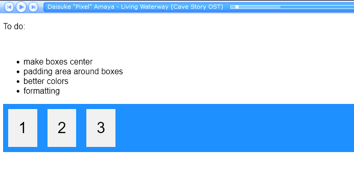
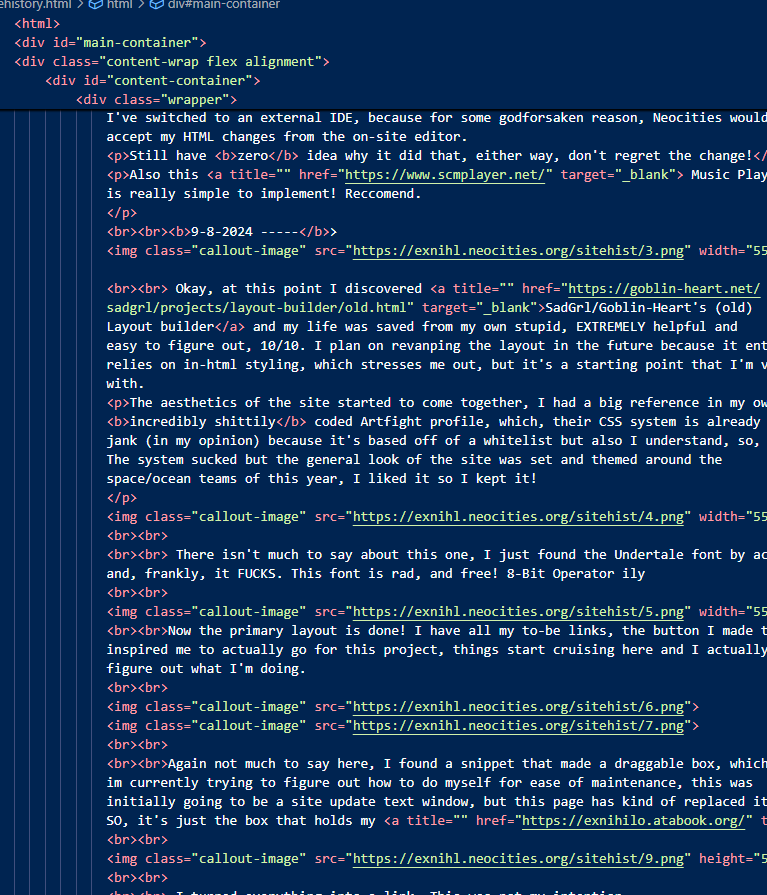
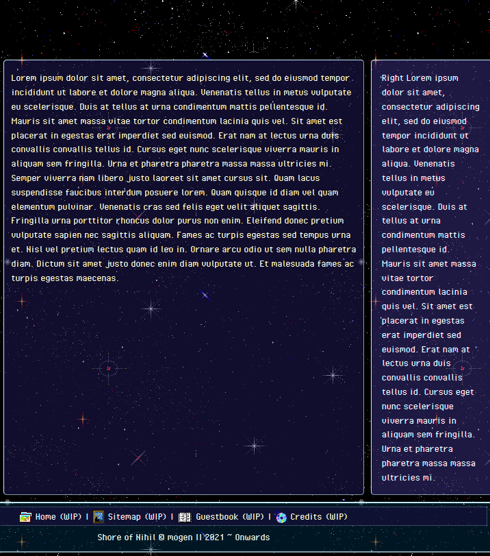
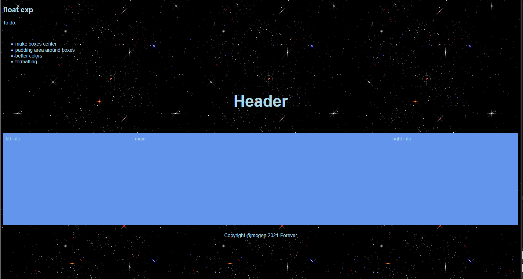
Me once trying to figure out flex boxes for... I think the 3rd time? Same list, same- what is it- cornflower blue? that VSCode give you in the dropdown? Yeah at this point I've switched to an external IDE, because for some godforsaken reason, Neocities wouldn't Neocities wouldn't accept my HTML changes from the on-site editor.
Still have zero idea why it did that, either way, don't regret the change!
Also this Music Player is really simple to implement! Reccomend.
